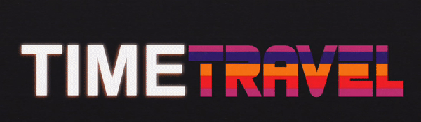
Typetravel
Typetravel is an interactive platform that transforms reading into a virtual time-travelling experience from past to future typography trends. Users are free to choose different styles and reading modalities to obtain an unconventional and pleasing reading experience.
The concept
Typetravel allows users to read and compare articles with different styles of display. Articles come from different sources and are grouped into issues according to their topic. Users can select the desired styles in the menu, choosing among the four themes provided: Renaissance, Secession, 1980s, Future. The name Typetravel refers in fact to the possibility of travelling in time and seeing different typographical styles and layouts (the meaning of type in this case is printed letters). The logo of the website encapsules this idea: it represents the letter T with clock hands (Figure 1). The T stands for the initials of the words Type Travel and is also used as an icon for the concept of typography. The clock hands symbolize time and, in this case, time travelling, which is the main concept of the website.
Figure 1: Typetravel logo
The styles were inspired by design trends of each period and are based on original resources (magazines, printed books, computer graphics and more), which were edited and adapted to guarantee a pleasing reading experience.
Users interested in discovering more about the content of the articles can also exploit further functionalities in the information section next to the articles.
How to use it
Users can start navigating by exploring the homepage, in which goals and the overall structure of Typetravel are provided. The homepage, as all pages on the website, is available in all four styles, so that users can try and apply them to different layouts.
After a short presentation of the themes, users can select one of the issues at the bottom of the page and begin the reading experience.
As the users reach the issues section, they can visualise them in two ways: the default mode and immersive reading mode. In the default view, articles are displayed in three columns next to a further column containing metadata information (Figure 2). Users can highlight the different keywords, which are grouped into macro-categories related to the topic of the issue. The issue Female nude painting throughout art features information on relevant people, places, artworks, and events. In The future of architecture issue users can discover the people, places, buildings and organizations that are referenced, while easily jumping from one keyword to the other.
Figure 2: Metadata information of the articles in this website's issues
The website also provides users with the possibility of diving into an immersive reading mode, accessible by clicking on the button on the top-right button of the screen – “Read better”. The three columns containing the articles will expand to cover the whole window. The experience does not stop here, as the articles will enlarge when the cursor hovers over them, providing improved readability. The user can click on the same button (“Read more") to show the metadata again (Figure 3).
Figure 3: Screenshot of reading mode in articles section
The advantage of Typetravel is that it provides the user with the freedom of choosing the format and the styles in which they wish to visualize the articles. Users can change the theme with just one click, selecting the style in the navigation bar under Themes or choosing one by selecting the buttons on the bottom-right side of the page (Figure 4).
Figure 4: Buttons for style selection
Layout and typographic styles
Each one of the styles - Renaissance, Secession, 1980s and Future - was inspired by original sources, carefully selected after an accurate research to offer real content from each epoque, from the font to the design. The process of selection of visual references and subsequent editing by the developers is detailed in the following paragraphs. A further style was added to be used as default theme, called Basic Style. Since it is not based on any historical design trend, it is not featured in the following documentation. It was designed to provide a basic theme for users that are only interested in reading the articles without experimenting with styles.
In the next sections, we will guide you through the design of each theme, explaining the decisions behind the design. You can click on the style names in the titles to change the theme.
The Renaissance style refers to the style of typography and art at end of 15th and beginning of 16th century. It imitates the harmonic disposition of text on the page and aims at reproducing the feeling of reading the page of a printed book from early Italian printing presses.
FONTS
The font Bembo was chosen for this style, a serif typeface based on the roman style designed by Francesco Griffo for Venetian printer Aldo Manuzio.
The name "Bembo" refers to the first publication with the font, the book Petri Bembi de Aetna Angelum Chabrielem liber, usually referred to as De Aetna, by Italian humanist poet Pietro Bembo (Figure 5). Among other possible fonts, Garamond was considered as the main alternative to Bembo due to its higher similarity to the original source De Aetna. The choice was ultimately on Bembo due to the wider influence that this font and the other typefaces designed by the Aldine Press had over the typographers of the period.
The version of Bembo adopted in this work is the result of a redesign by Monotype in 1990. The difference can be seen in Figure 5 below. The main differences between the two fonts are the use of the "long" s (ſ), the several ligatures (s and t, c and t), or symbols that are fallen into disuse (such as ꝗ).
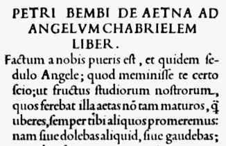
Figure 5: Incipt of De Aetna
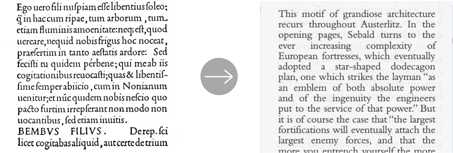
Figure 6: Extract from De Aetna (left), screenshot from the issue section of this website (right)
TEXT & LAYOUT
The text of the articles on this website was justified and spacing on the sides was added to imitate the page structure of renaissance printed books, as shown in Figure 6. Text content was justified manually by adding or removing spaces when necessary in early printings, thus it is possible to observe some peculiarities in the original documents, such as the missing spaces after punctuation. While it would be historically accurate to reproduce such details, the developers decided against it for the sake of maximasing readability.
Titles in 1500s printings had the purpose of imitating Roman Epigraphy, and were thus are written in uppercase letters. Multi-lines titles alternated smaller and larger font-sizes, as shown in Figure 7. Furthermore, increased letter spacing was a feature in many by original prints (Figure 7). All these design choices were implemented, while minimising compromises on the readability of the content
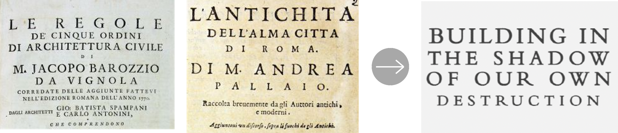
Figure 7: Vignola, Le Regole de’ cinque ordini [...], Palladio, L’antichità dell’alma città di Roma [...], screenshots of title in issue section (right)
The inverted triangle-shaped paragraphs below the title were an extremely popular feature of titlepages of Reinassance printings and thus they were adopted by TypeTravel. (Figure 8).
Spacing between text lines was set to 1 to imitate the orginal printed pages, in particular Pietro Bembo's work De Aetna, as shown by Peter Burnhill in his work "Type spaces. In-house norms in the typography of Aldus Manutius" (page 8, page 68 - Figure 9).
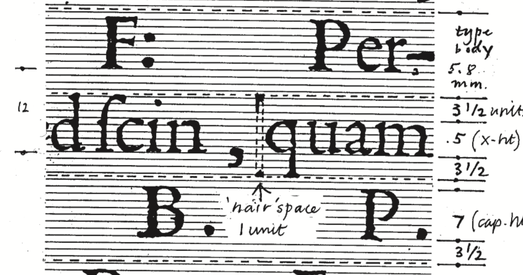
Figure 9: Burnhill, Type spaces, p. 43
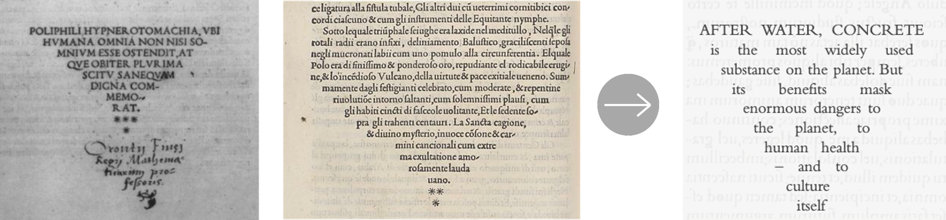
The first letter of each article was represented using a decorated initial from the book Hypnerotomachia Poliphili - available here (Figure 10).
Figure 10: Top: Detail from a page of the Hypnerotomachia Poliphili (left) and detail from Vitruvius' De Architectura, printed in 1497. Bottom: screenshots from issue section
The first line of each article presents uppercase letters, also inspired by Renaissance printings, and in particular by the Hypnerotomachia Poliphili - available here - as shown below (Figure 11).
Figure 11: Screenshot of a page of Hypnerotomachia Poliphili (left) and screenshot from the issues sections (right)
More resources on Renaissance typography:
- Olocco, Riccardo: De littera veneta, Venice 2010 (PDF)
- Burnhill, Pete: Type spaces: in-house norms in the typography of Aldus Manutius, London 2003 (find online)
- Boardley, John: The first Roman fonts (online article)
IMAGES & LAYOUT
The background of the main body of the articles can be seen in Figure 12. The image, which is a partial representation of a page from the book De Aetna (Figure 12, left), could go unnoticed at a first glance, since it is intentionally unobtrusive. An attentive observer will see that the represented text is mirrored; in fact, it aims at representing the text printed on the other side of the page of early books, which typically transpired and was thus partially visible on the other side (Figure 12, right).
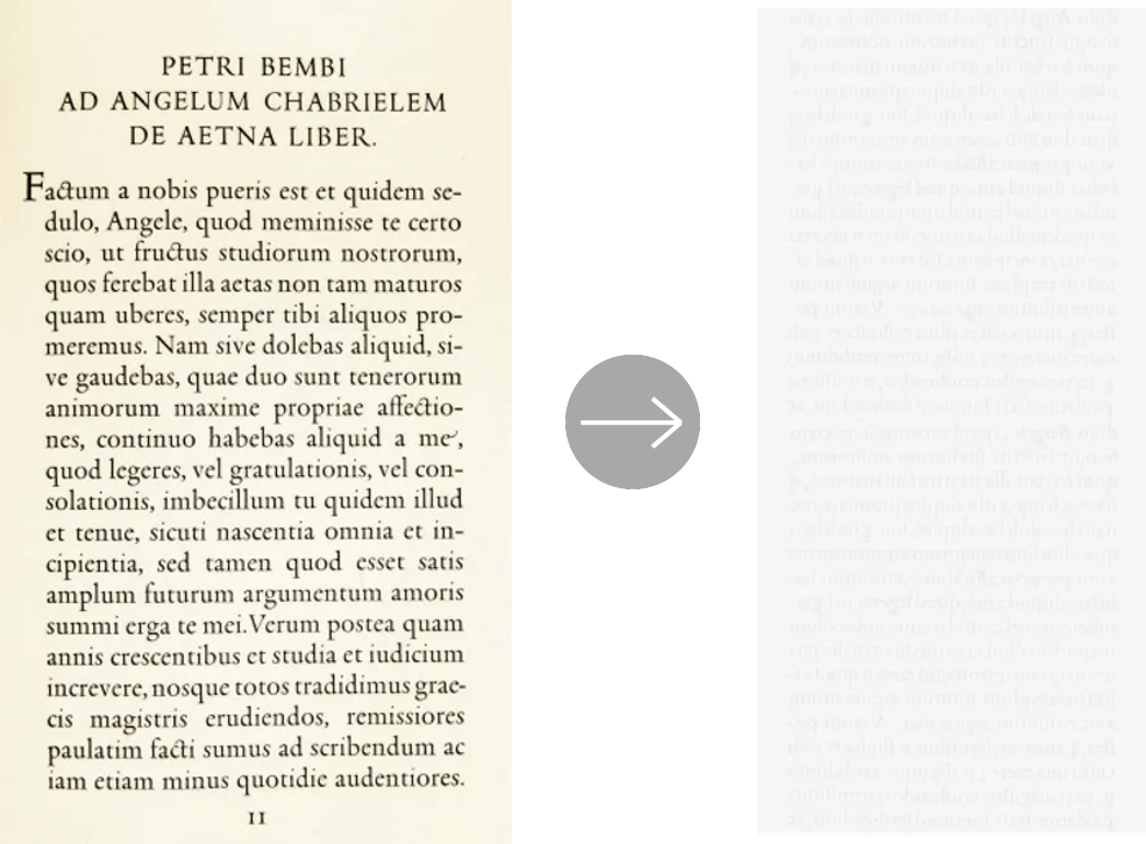
Figure 12: Bembo's De Aetna (from Olocco, De littera veneta, pag. 28) (left), same image was edited to be used as background for the articles (right)
Articles are framed with decorative elements, represented in the background of the navigation bar and of the information section. These images were edited to provide a darker frame to the light-grey text background, as a way to imitate darker frames surrounding text in Renaissance books (Figure 13).
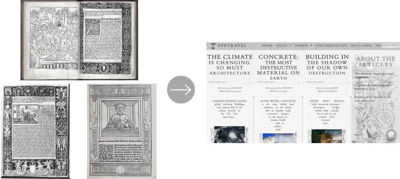
Figure 13: Screenshot from this website's issues section (right); left, clockwise from top left:
- Saint Bonaventura: Le devote meditatione sopra la passione del nostro signore, 1487 (Met Museum)
- Giovanni Andrea Vavassore: Opera Nova Universali intitulata Corona di racammi, 1530 (Met Museum)
- Jacobus Gualla: Papie sanctuarium, 1505 (Library of Congress)
The decorative images are original examples of Renaissance Grotesque art, drawings of an anonymous Italian artist inspired by a print by Cornelis Bos. They are part of the 1540 series of drawings Candelabra Grotesque with a Large Vase Flanked by Sphinxes by the anonymous artist and are included in the collection of the Metropolitan Museum of Art.
The images of the series that were used in the sections of the website are displayed here. All images were edited to fit the style of the website.
Image 60.643.4(1) Recto is used as background on the right side of the issues section (Figure 14):
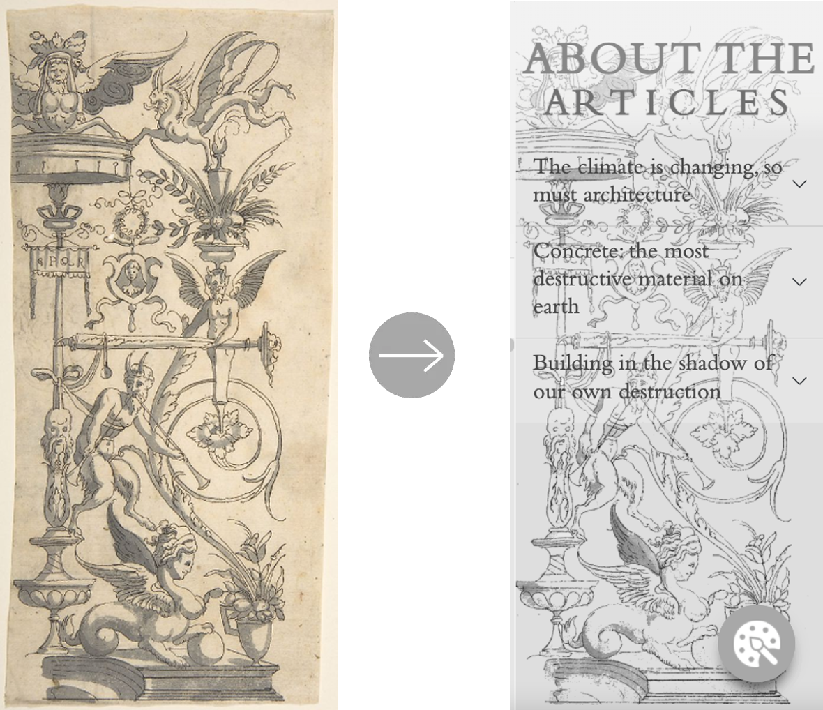
Figure 14: Image 60.643.4(1) Recto (left), screenshot from issue section (right)
A detail from image 60.643.4(7) Recto was made into a decorative element for all article images (Figure 15):
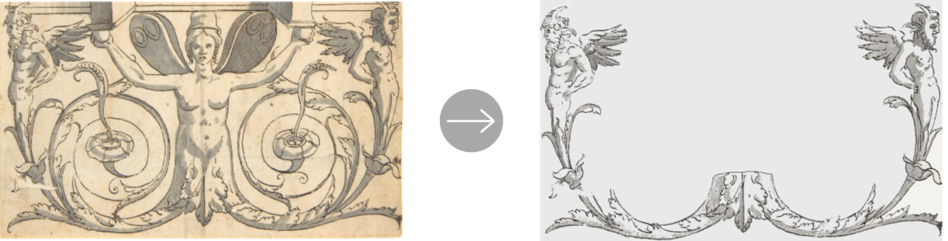
Figure 15: Detail from 60.643.4(7) Recto (left) used as ornament for article images (right)
The image used as background of the navigation bar is taken from Constantino Lascaris's work Erotemata (Figure 16).
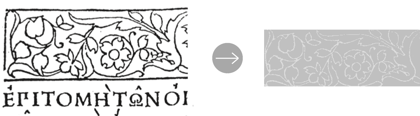
Figure 16: Detail from Erotemata (left) used as navbar background (right). From: Burnhill 2003, p. 20
Image 60.643.4(1) Recto was also used as side decoration at the top of the homepage. The detail of a winged creature from the same image is used as button decoration at the center. These decorative elements aim at reproducing title pages of early printed books, which presented decorations as frames for the titles on the cover page (Figures 17, 18).
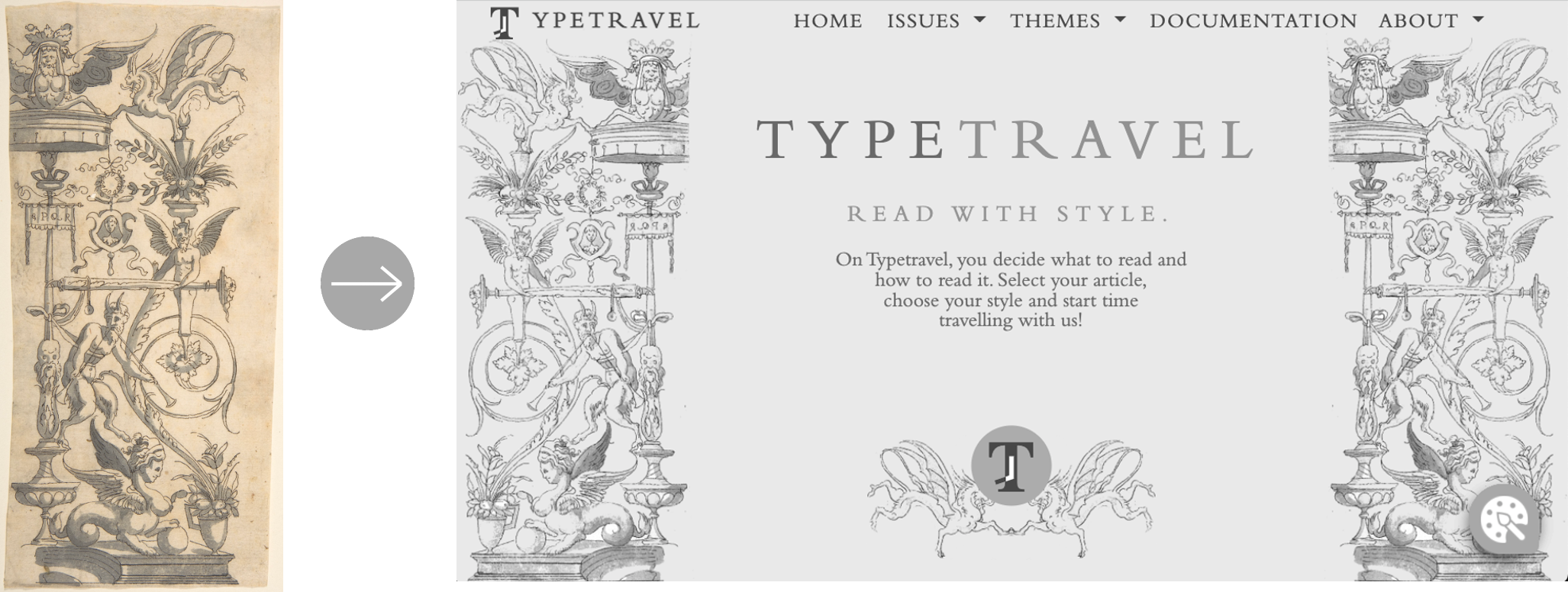
Figure 17: Image 60.643.4(1) Recto (left) used as homepage decoration, detail as button decoration (right)
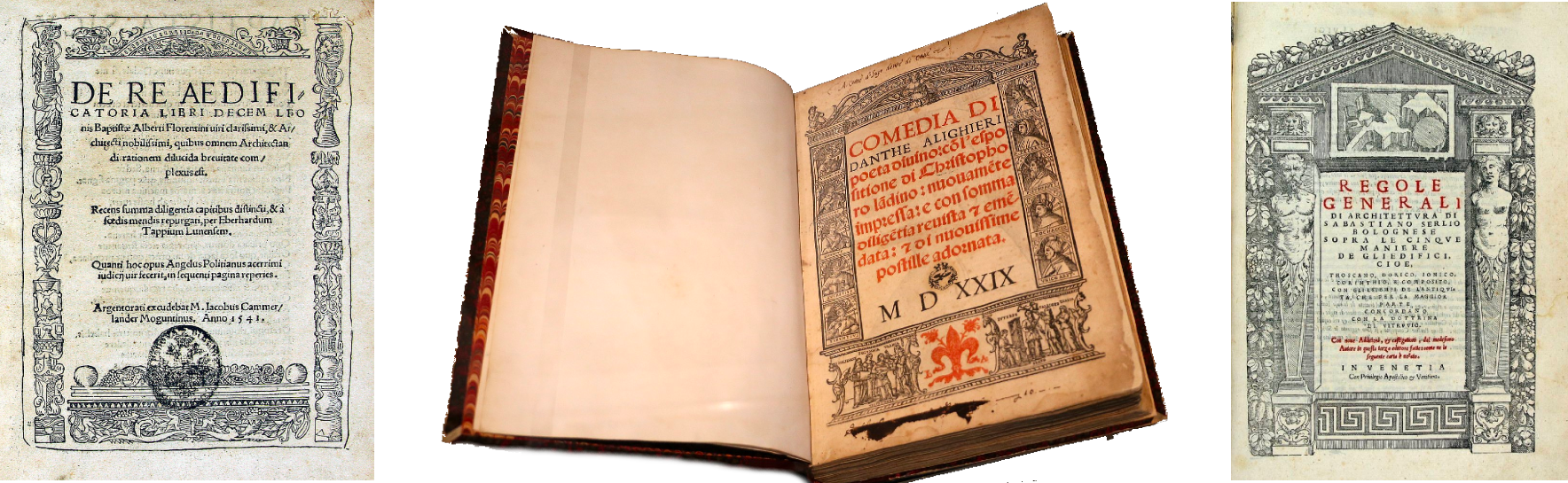
Figure 18: Left: Leon Battista Alberti: De re aedificatoria, 1541 edition; center: Dante Alighieri: Comedia, 1529 edition; right: Sebastiano Serlio: Comedia
The homepage features image 60.643.4(4) and a detail from image 60.643.4(9) (Figure 19).
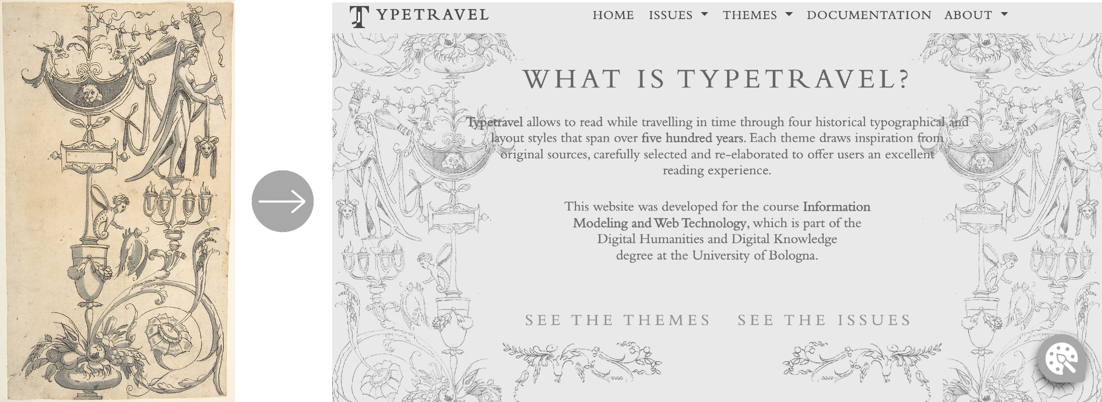
Figure 19: Image 60.643.4 (1) Recto from Candelabra Grotesque with a Large Vase Flanked by Sphinxes, anonymous (left) and screenshot from the homepage (right)
The image Petite arabesque from the collection of the Victoria and Albert Museum was used for the bottom sections of the homepage. It is a grotesque ornament print by Renaissance architecture designer Jacques Androuet Du Cerceau (Figure 20):
Figure 20: Petite arabesque by Jacques Androuet Du Cerceau (left), screenshots from homepage (right)
COLOR SCHEME
The colors used for the Renaissance style aimed at reproducing dark printing ink on a white-light grey page (here, we refer only to the issue sections). The color selected for the text content is #424242, a dark gray which was considered more suitable to represent ink, which does not appear black on the page. The color #F2F2F2 was used for the background of the articles main body. It was chosen over the alternative of a yellow-white option. The reason for this choice was to maintain high readability (thus invalidating any darker color), while bringing the user back to the documents at the time of printing and not emphasizing the signs of time on the paper. A further motivation can be found in the intention of creating four clearly distinct styles, and preventing any overlap between this style and the Secession style, which features a linen-white background. The navbar and side decorations present darker colors than the text background, respectively #C0C0C0 and #E5E5E5, with the aim of framing the text content with darker elements. The color scheme is visible below.
Color #424242
Color #F2F2F2
Color #C0C0C0
Color #E5E5E5
The second style developed for this website is based on the work of the artistic movement of the Viennese Secession. In particular, it draws inspiration from the Austrian magazine Ver Sacrum, founded in Vienna by secessionist artists Gustav Klimt and Max Kurzweil and published from 1898 to 1902. The magazine aimed at spreading the new artistic style through the publication of illustrations and decorative elements and the characteristic layout design.
The Vienna Secession can be referred to as the Austrian version of Jugendstil, the German term for Art Nouveau. It was one of the several artistic movements that arose at the end of 19th and the beginning of 20th century in Europe, all showing different traits but all with the goal of breaking from the conservative academic European standards for arts. The Viennese Secession developed an organic style with stylized floral designs and curvilinear patterns, differently from the less geometric and more sinuous style typical of Art Nouveau. The movement had a particular focus on design and architecture, main topics in the issues of Ver Sacrum.
TEXT: FONTS & LAYOUT
The fonts Secession, for titles, and The Golden Type, for textual content, are protagonists of the Secession style on Typetravel.
Secession is an elegant narrow typeface with very high waistlines (Figure 21), typical traits of fonts designed by Viennese Secession artists. It is inspired by the font Secession, designed by Bauer & Company of Stuttgart and H. Berthold AG of Berlin around 1898.
Figure 21: Example of title in the issues section
The font Secession also has features in common with several fonts of the time. It resembles the thinner and more geometrical fonts by Charles Rennie Mackintosh, a Scottish designer which influenced the Secession movement (see pages 402 and 403 of the third issue of year 1901) and the geometric shapes of the fonts designed by Koloman Moser (Figure 26). A further similar alternative to Secession is the font Willow, based on the typeface designed by Mackintosh for the logo of the Willow Tearooms in Glasgow (Figure 24). Secession shows traits in common with many typefaces featured in Ver Sacrum, and in general with fonts designed by Secession artists, as shown in the images below:
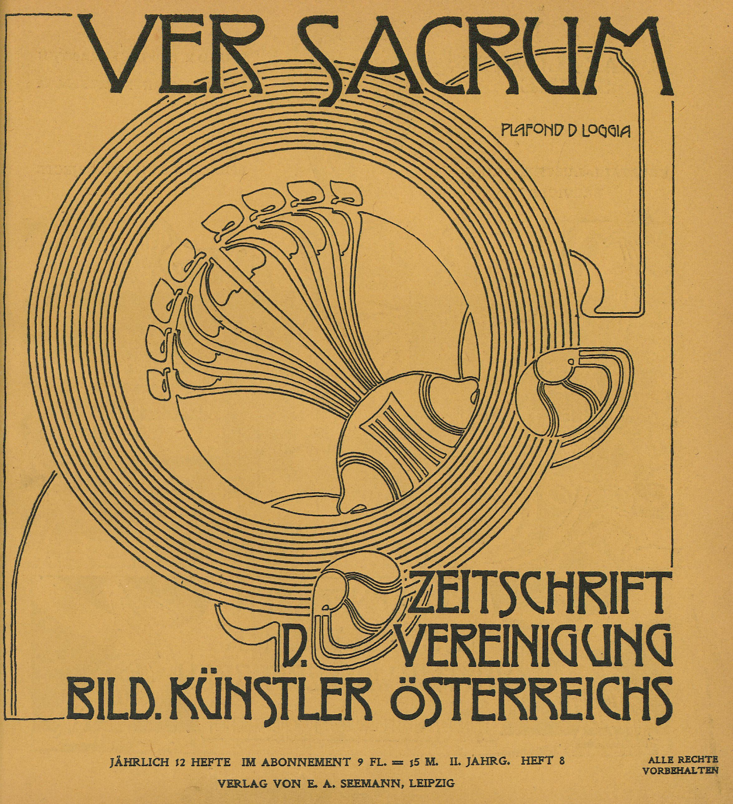
Figure 22: Ver Sacrum, issue 8 (1899), cover page.
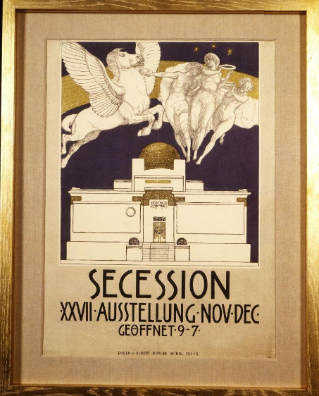
Figure 23: Poster for the 17th Vienna Secession designed by Rudolf Jettmar, Austria, 1903 (Victoria & Albert Museum, London)
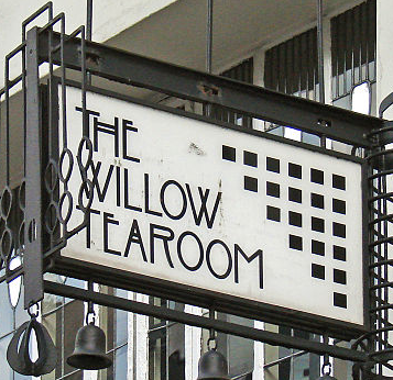
Figure 24: Willow Tea Room logo designed by Charles Rennie Mackintos, Glasgow 1903 (Wikimedia)
Figure 25: Ver Sacrum Heft, Joseph Maria Olbrich 1900
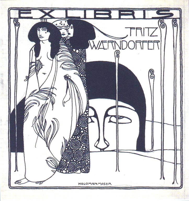
Figure 26: Exlibris, Koloman Moser, Fritz Waerndorfer, 1903
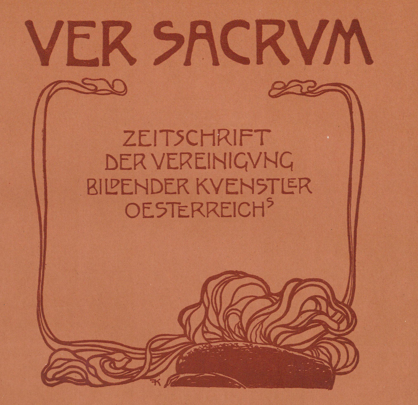
Figure 27: Ver Sacrum, issue 11 (1899), cover page
Secession was selected among several possible alternatives for its simplicity and readability, as well as for the compatibility and harmony with the font used for the articles content.
Golden Type ITC Std (available here) is the font selected to display the articles content (Figure 28). The Golden Type was designed by artist William Morris from the Arts and Crafts movement in 1890. It is the font used for the textual content of the magazine Ver Sacrum in the issues between 1898 and 1900. The Golden Type is an "old style" serif font based on type designed by Nicolas Jenson in Venice around 1470, and it is named after The Golden Legend, supposedly the first book printed using it. The line spacing of the articles was set to 1 to reproduce the text on Ver Sacrum. Below you can see a comparison between the font of Ver Sacrum and the font used in this website's article section (Figure 28):
Figure 28: Screenshot from Ver Sacrum, issue 10 (1899), page 33 (left), screenshot from issue section (right)
While researching for the exact font, further similar fonts that were taken into consideration are Della Respira, Della Robbia and Doves Type, due to the shape of oblique bars (see lowercase e) and bowls (see lowercase a) and thin terminals.
The larger initial letter visible in each article of this website is a further feature of the Secession style that can also be observed in the magazine (Figure 29):
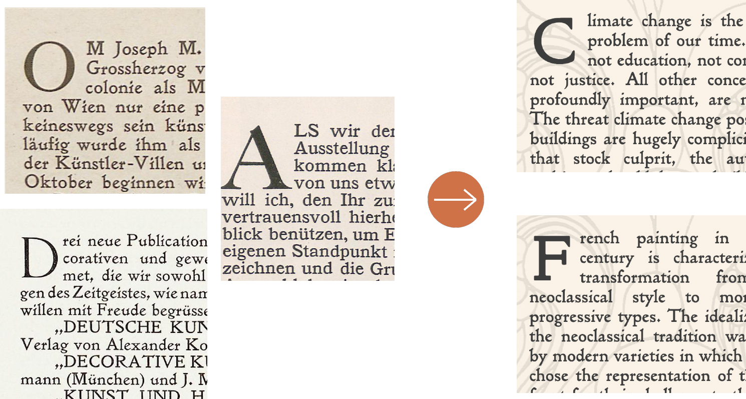
Figure 29: Drop caps from Ver Sacrum (find them here: O, A, D), issue 10 (1899), page 33 (left), screenshot of drop caps in the issue section (right)
The layout of text of Ver Sacrum was also reproduced in the issue sections: as it is on the magazine, text content appears justified and an indentation of the beginning of each paragraph was added (Figure 30):
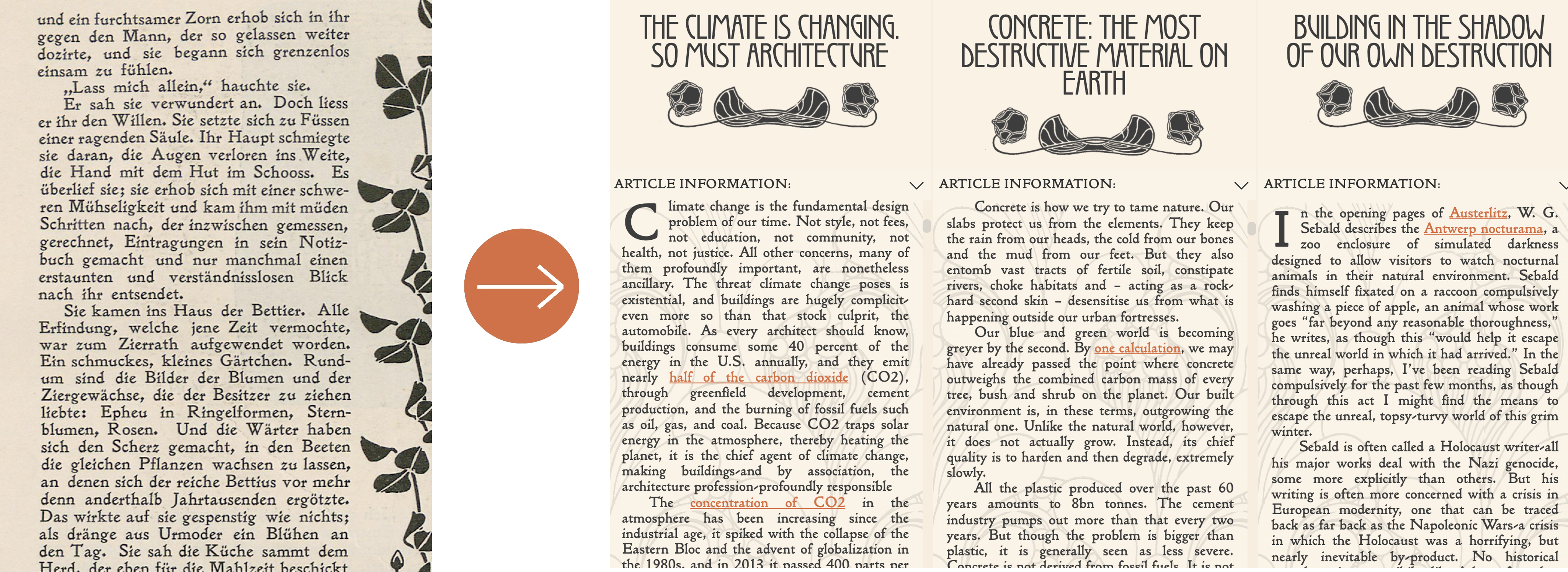
Figure 30: Screenshot of a page from Ver Sacrum, issue 5 (1899), page 19 (left) and screenshot of issue section (right)
IMAGES & LAYOUT
The decorative images used in this website are taken from the magazine Ver Sacrum (digitalization by Heidelberg University) and edited to better fit the layout of the webpage.
The side decoration in the issue sections is a floral design by Koloman Moser (Figure 31), founder and designer of the magazine, available at page 27, issue 5, year 1899:
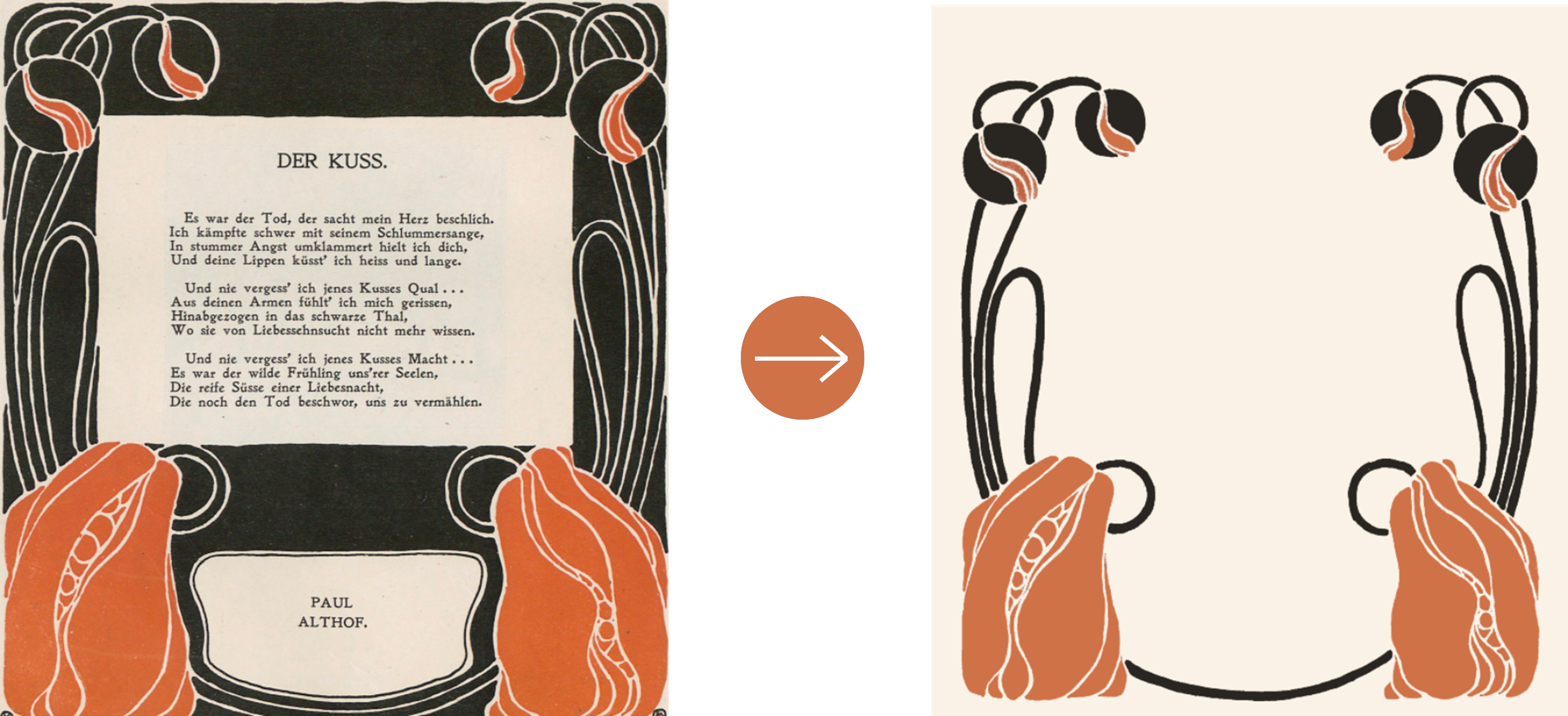
Figure 31: Text frame by Koloman Moser (left), edited and used as background in the issues section (right)
Decorations of the headers were edited from Joseph Maria Olbrich's illustration of the Viennese Secession building on page 12, issue 1, year 1899 (Figure 32):
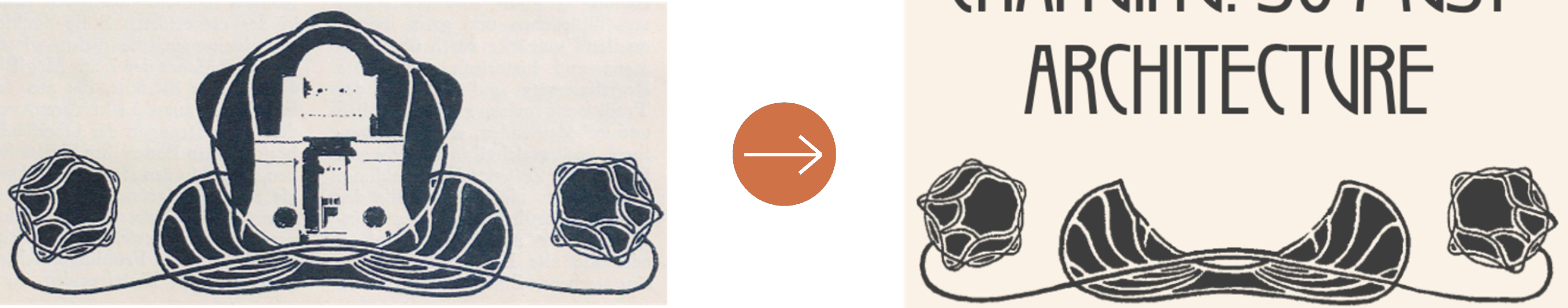
Figure 32: Illustration by Joseph Maria Olbrich (left), edited and used as decoration under the title in the issues section (right)
Images in the articles have a rounded frame that aims at imitating the one used occasionally on Ver Sacrum (Figure 33). Finally, the image used as background for the articles' text is Blumen erwachen, an illustration by Koloman Moser published on page 13, issue 4, year 1899 (Figure 34):
Figure 33: Images from Ver Sacrum (issue 1898, 1899, 1900) (left), screenshots of images from the issues sections (right)
Figure 34: Blumen erwachen designed by Koloman Moser (left) and used as background for the articles content in the issues section (right)
The homepage features further illustrations inspired by Ver Sacrum and the Viennese Secession, displayed below.
The frame and decoration at the top of the page are from issue 4 (1900), page 53, and issue 20 (1900), page 301 (Figure 35):
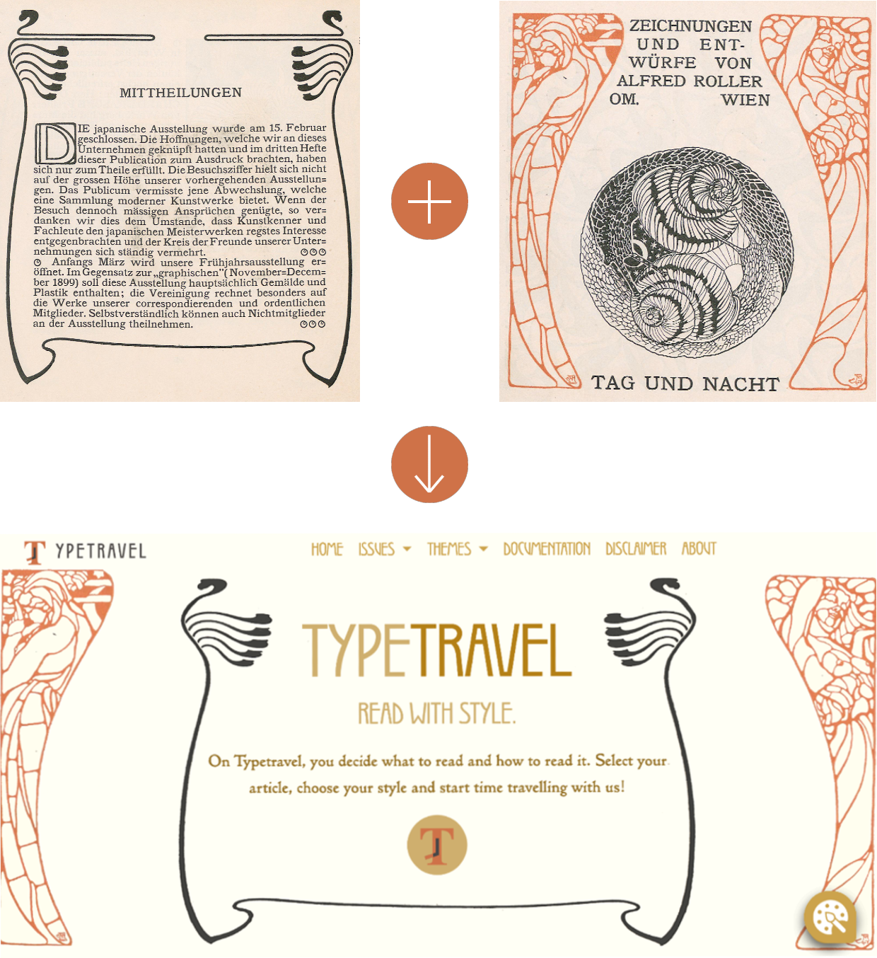
Figure 35: Frame design by Adolf Michael Boehm, stencil design by Alfred Roller (left and center), screenshot from the homepage (right)
The illustration on page 213, issue 14 (1900) was edited and used as frame for the text in the second section of the homepage (Figure 36):
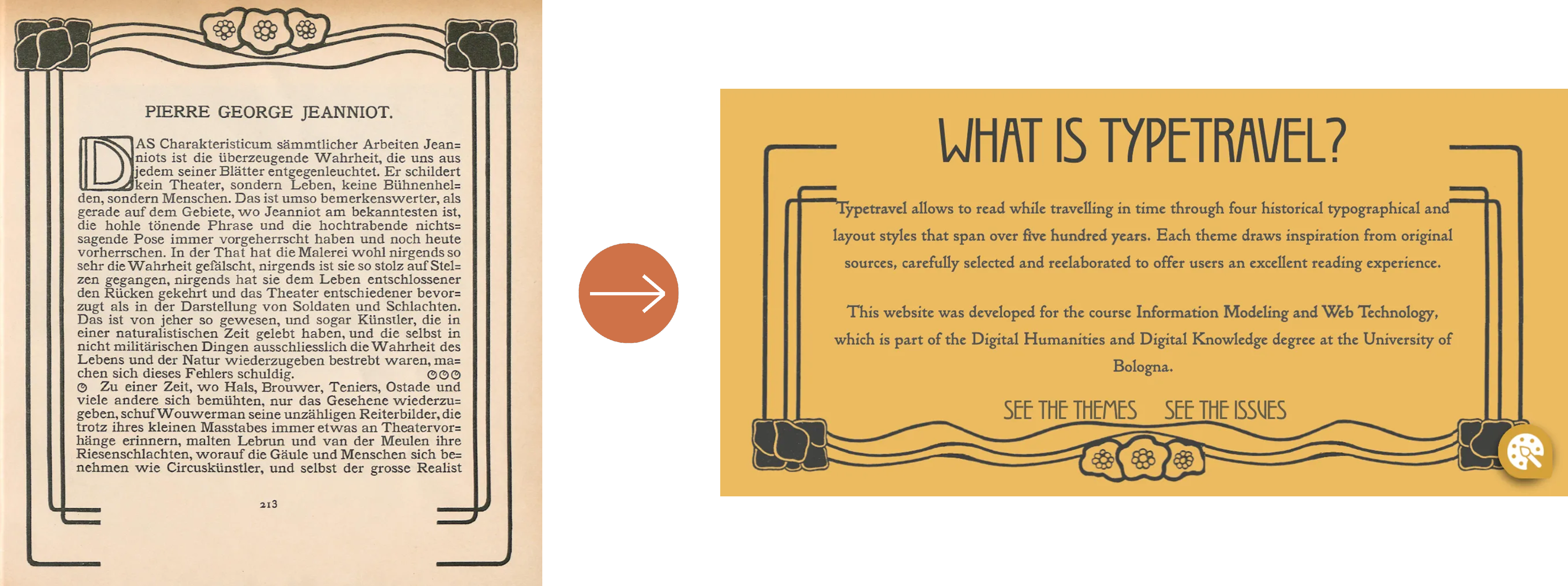
Figure 36: Frame design on Ver Sacrum, page 213, issue 14 (1900) (left); screenshot from the homepage (right)
Koloman Moser's design Blumen erwachen (Figure 34) was used as background for the Themes section of the homepage (Figure 37 - top-right). The title of the themes and issues sections of the homepage were decorated using an edited version of a title ornament by Joseph Maria Olbrich, available on page 34, issue 10, year 1898 (Figure 37):
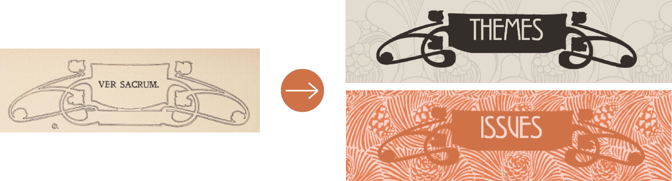
Figure 37: Title ornament from Ver Sacrum, page 34, issue 10, year 1898 (left), screenshots from the homepage (right)
A further pattern from the magazine was used as background for the issues preview section on the homepage: the illustration Pinus Austriacus, designed by Koloman Moser and available on page 7, issue 4, year 1899 (Figure 38).
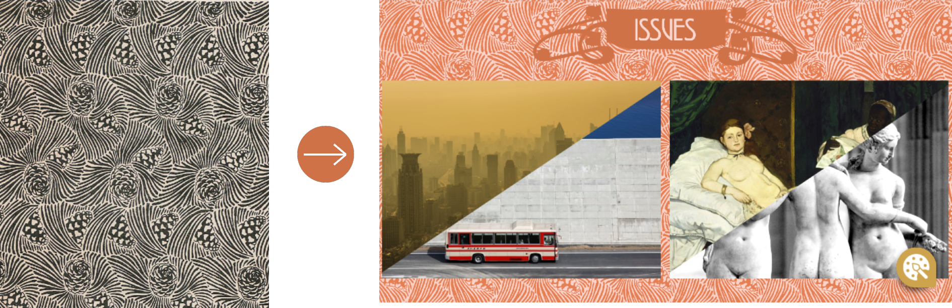
Figure 38: Pattern design from Ver Sacrum, page 7, issue 4, year 1899
Finally, a page ornament by Olbrich was used to design the footer section (page 6 and 7, issue 1, year 1899, Figure 39):
Figure 39: Designs by Joseph Maria Olbrich (page 6 and 7, issue 1, year 1899) used as decoration for the homepage footer
COLOR SCHEME
Three contrasting colors were used for the Secession style. The color #3d3d3d, was chosen for the text, a dark gray - variation of the color Mine Shaft - which aims at reproducing the color of printed words on the page of the periodic Ver Sacrum. The color #FAF2E6 was selected for the articles background, imitating the color of the paper of Ver Sacrum. The background is completed with the decorative pattern Blumen erwachen (Figure 34) as a way to enhance the decorative tendence, typical of the Viennese Secession. The third main color used for this style is #CF7248, obtained by sampling the color of Koloman Moser's floral decoration in the issues sections (Figure 31).
Color #3D3D3D
Color #FAF2E6
Color #CF7248
The 1980s style is the third theme created for Typetravel. This theme aims to reproduce the typical traits of the colorful and eccentric style of this decade. It features contrasting colors, fonts of different sizes and shapes, dark backgrounds, and color gradients. During the 1980s, the world of graphic design went through a revolution through the adoption of design software and computers in general. The resulting freedom and ability of experimentation led to the production of eye-catching results and bold, neon-color typography. The developers' interpretation aims at reproducing these characteristics, drawing inspiration from different elements of the 1980s culture. Among the several style trends of the decade, the main inspiration for the style falls under the design category of '80s Digital Style, characterized by the centrality of scientific and technology-related elements. Several characterizing elements of the Cyberpunk style were also implemented, as discussed below.
TEXT: FONTS & LAYOUT
Three fonts were used to reproduce the style of the 1980s: the fonts Arial and Johnny Fever were used for titles, while VCR OSD Mono was selected for textual content.
The image of a VHS videotape (Figure 40, left) was used as main reference for the design of the titles. Videotapes entered home use in the 1970s, when the home video industry was created. In the later 1970s and in 1980s, however, a format war involving mainly Betamax and Video Home System took place, and in the 1980s VHS became the world market leader. Furthermore, the home video industry boomed in the 1980s, as the price of VCRs decreased and more and more customers bought them.
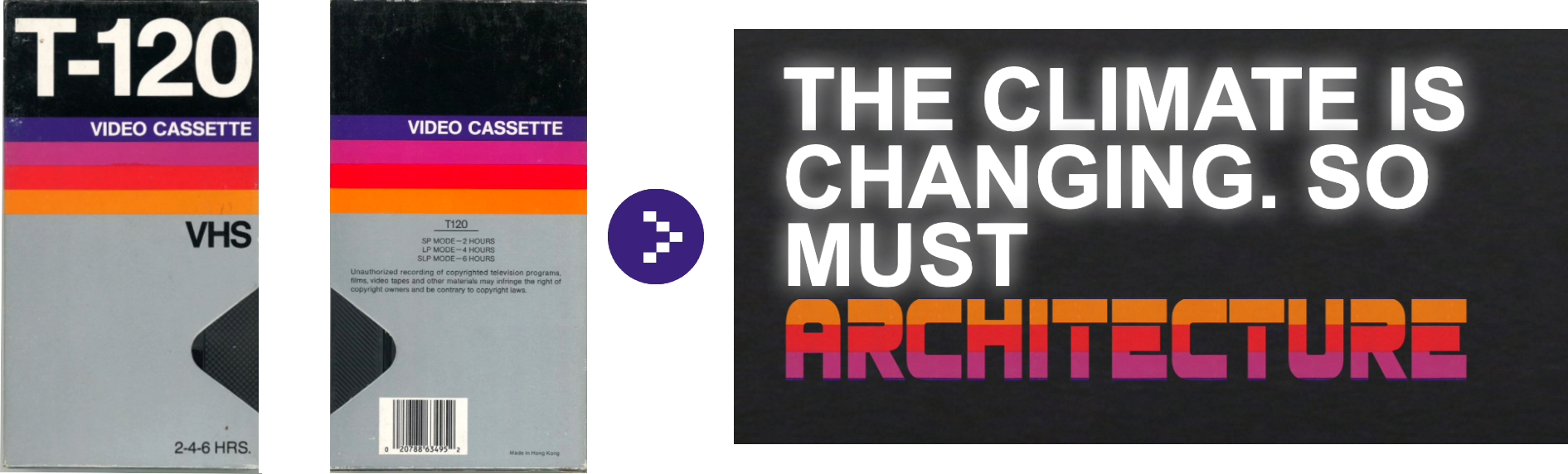
Figure 40: Blank VHS Cover (left) used to design the titles of the issues section (right) and on the homepage (below)
While the font of the main reference is Helvetica, the choice of font for the titles of the project was Arial (Figure 40).
Arial was released by Monotype Typography in 1982 and immediately became extremely popular; it was created to be metrically identical to Helvetica, so that a document designed in Helvetica could be displayed and printed correctly in Arial, thus avoiding the expensive license for Helvetica. A comparison between Arial and Helvetica is available here.
The last word in each title, however, is represented using the font Johnny Fever (the name is inspired by fictional character of the 1980s American sitcom WKRP in Cincinnati Dr. Johnny Fever). It is a bold cap typeface inspired by Amiga 4k demos. The color bar on the VHS cover (Figure 40, left) was used as background for this font, with the intention of reproducing 1980s titles featuring different font families, weights, sizes and contrasting colors; VHS design was again a major inspiration for this design (Figure 41). The same design was used for the homepage title (Figure 40, bottom)
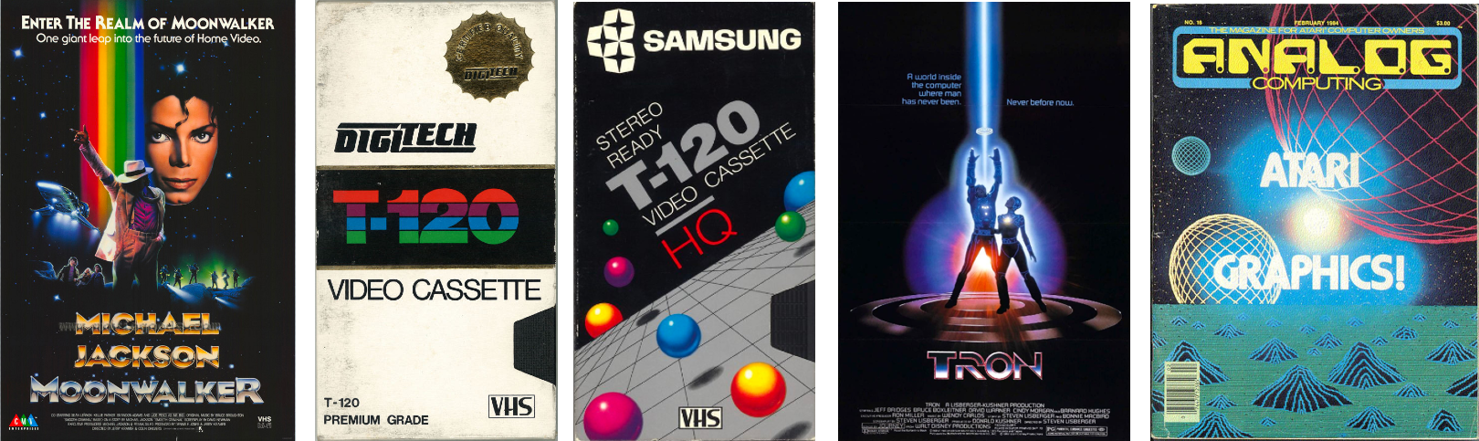
Figure 41: Examples of 1980s graphic design displaying design trends of the decade: neon colors, changing font weights, sizes and families, and color gradients (resources, from left to right: 1, 2, 3, 4, 5)
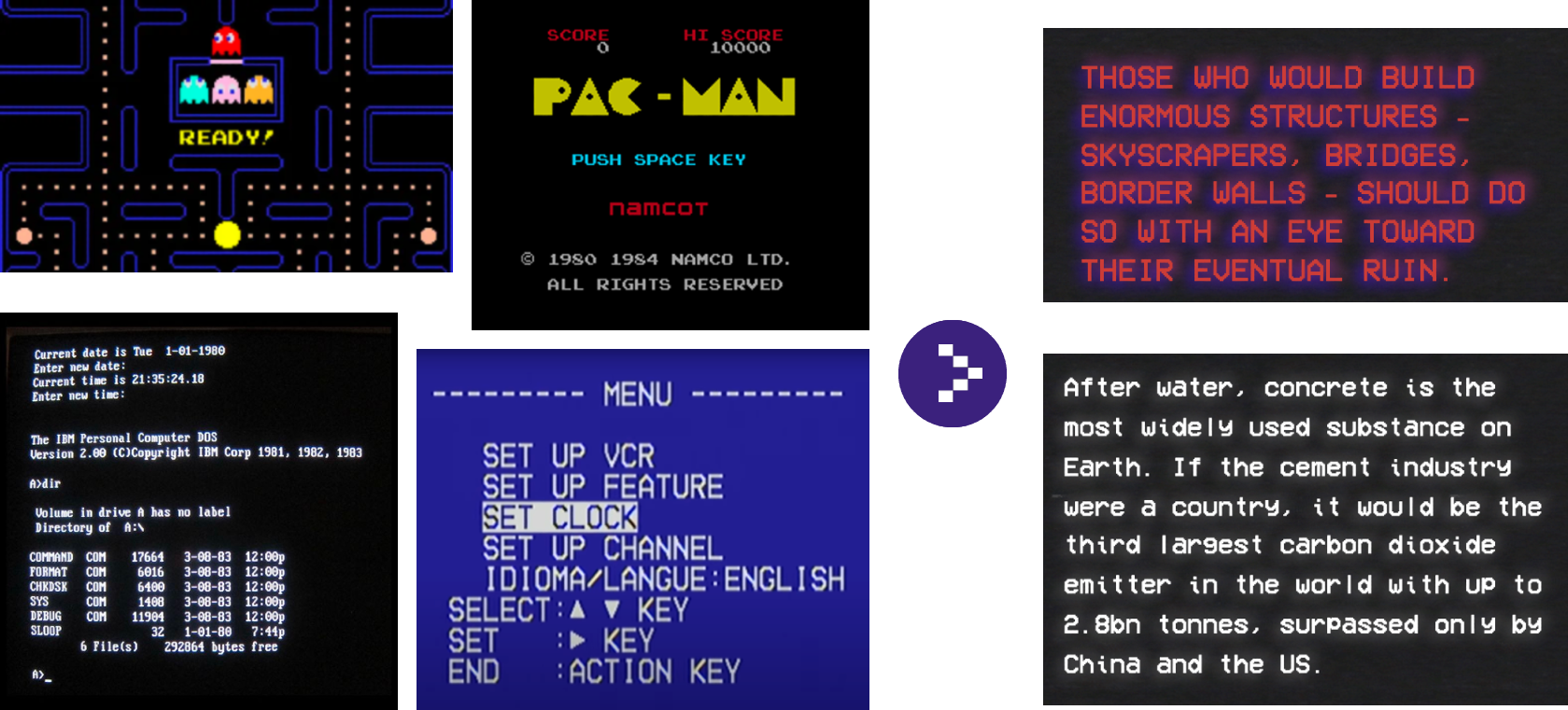
The font VCR OSD Mono was used for the articles content. It is a bitmap - or pixelated - font based on VHS text on TVs, low resolution computer screens, and on arcade games, whose popularity grew rapidly between the late 1970s and the early 1980s in the 1980s (Figure 42).
Figure 42: Examples of pixelated text on screen (left), screenshots from this website (right). Resources, clockwise from top-left: 1, 2, 3, 4.
The aim of the second section of the homepage, in particular, was to reproduce the VHS blue intro screen (Figure 43):
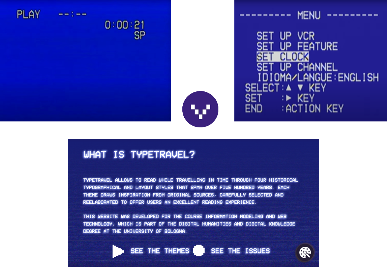
Figure 43: examples of VHS intro screen (above), screenshot from the homepage (below)
A final visible feature related to the text content is the shaded effect created through a fading white text-shadow. This effect has the aim of reproducing the chromatic aberration effect typical of CRT monitors (Figure 44).
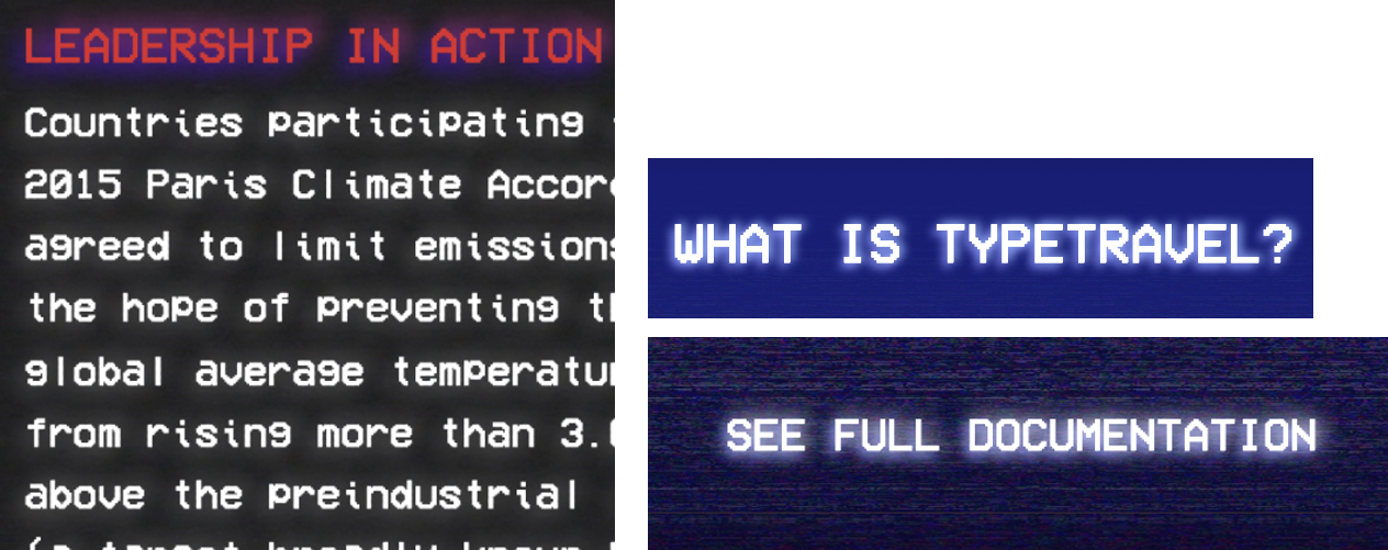
Figure 44: Screenshots from the website showing text with white shadow
IMAGES & LAYOUT
The 1980s theme does not feature many decorative images, since here colors and fonts are already used as decorative elements.
The graphics of the blank VHS cover was also used as background for the navigation bar (Figure 45).
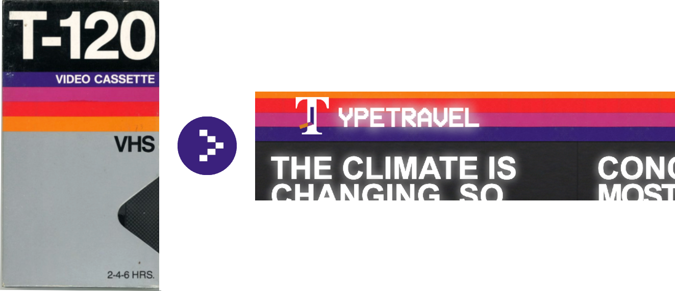
Figure 45: Blank VHS cover (left), screenshot from the homepage (right)
The gif in Figure 46 was used as background for the issue section and part of the homepage; it shows a glitching effect of a black screen. It is inspired by the use of dark backgrounds with contrasting text in the 1980s (Figures 46, 47) and in particular, by the typical effect of noise generation caused by the analogic nature of old CRT monitors - for this reason, a color gradient was added to change the color color from black to a faded black-dark gray.
Figure 46: Glitching black screen (gif)
Figure 47: Screen recordings showing glitching effect on the issue section (above) and the homepage (below)
A further gif of a dark screen with a glitching effect was used in the themes section of the homepage (Figures 48, 49):
Figure 48: Gif with glitching effect
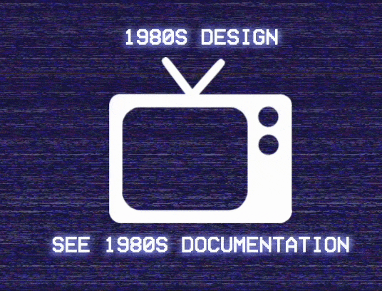
Figure 49: Screen recording from the homepage themes section, with edited gif on the left as background
A more evident glitching effect animation was added to the images of the articles (Figures 50, 51):
Figure 50: Gif with glitching effect
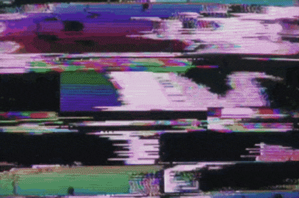
Figure 51: Screen recording from the issues section, with glitching gif edited as intermittent background
A graphic element typical of 1980s is the neon-color perspective grid, usually depicted as a network of glowing straight lines receding in perspective against a black background (Figure 52). It is featured in several posters and graphics of the decade (see images 3 and 5, Figure 41). It is an emblem of the Digital/Cyberpunk aesthetic - which are the trends represented on Typetravel. Grid designs were featured in movies, advertisement, computer animations, and arcade games.
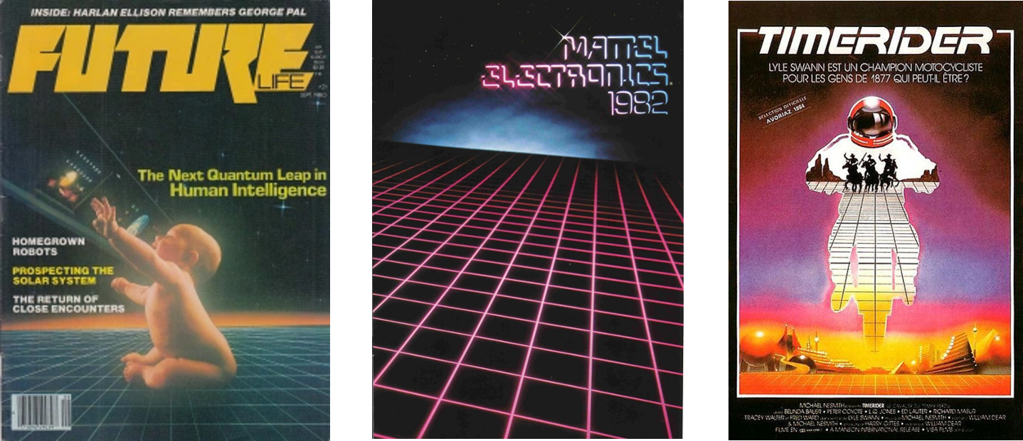
Figure 52: Three examples of grid designs from the 1980s. Left: Future Life, September, 1980; center: Mattel toys fair catalog, 1982; right: Timerider: The Adventure of Lyle Swann (1982), theatrical poster
The earliest and most relevant examples are from the 1981 computer animation Adam Powers, The Juggler, featuring various glowing grids, and the science fictions movies by Walt Disney Production The Black Hole (1979) and Tron (1982). The Black Hole's opening sequence shows a green laser grid suspended against a dark starscape (Figure 53) - the same effect was simulated in a 1980 Selectavision commercial. The movie Tron, on the other hand, is set in the "game grid", which makes up the world itself - a digital universe. One of the most iconic scenes involves the protagonists racing across a grid arena.
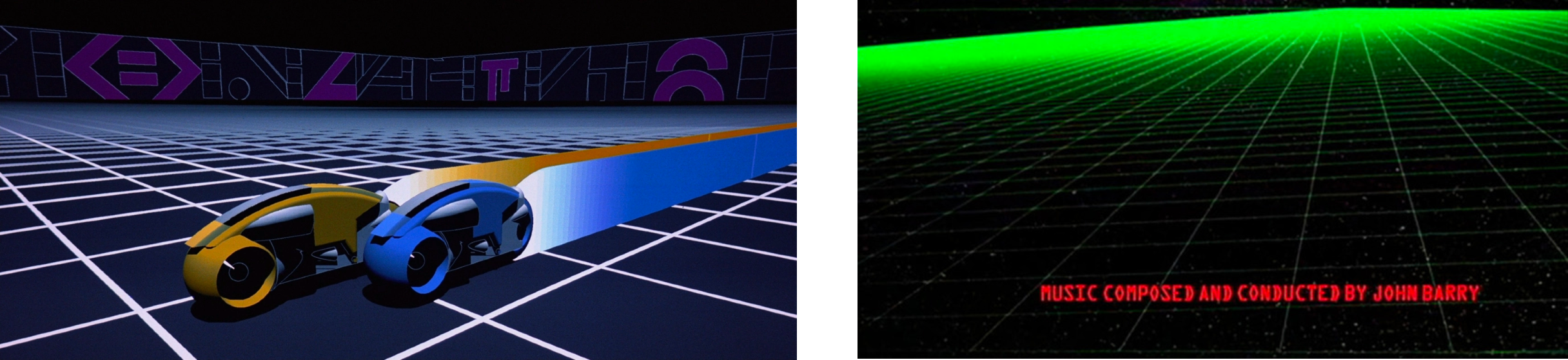
Figure 53: Frames from the movies Tron (left) and The Black Hole (right)
All these media products were used as reference for the grids represented on the side of the articles and in the first section of the homepage - as shown below in Figure 54 - and on this page (switch to 1980s style!).
Figure 54: Screenshot from the homepage (left) and the issues section (right)
The article Vanishing Point: How the Light Grid Defined 1980s Futurism provides a plethora of examples of grids and design elements of the 1980s.
The scrollbar designed for the 1980s theme is an accurate reproduction of the scrollbar developed for the first version Microsoft Windows, Windows 1.0, released on November 20, 1985 (Figure 55). The link provided here showcases the evolution of the scrollbar throughout the years.
Figure 55: Screenshot from Windows 1.0 bloc-notes (left), reproduction of the scrollbar on this website (right)
Finally, cursor and pointer were changed into older versions developed in the first releases of Microsoft Windows (Figure 56 - learn more about the history of cursors here).
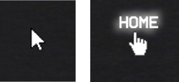
Figure 56: Cursor and pointer used in 1980s theme on this website
COLOR SCHEME
The 1980s style features the largest and most diversified color palette. The color scheme on the VHS cover in Figure 45 (left) was taken as main inspiration for the selection of colors to be applied in the articles section. Several variations of the colors featured in the image were applied to the style.
Even if vivid neon colors immediately grab the attention of the user's eyes, the prevailing color of this style is #20221F, which results from the addition of a dark gray linear gradient over the background gif displayed in Figure 46.
Different colors were used to represent the font: white was chosen for the articles content, inspired by white text on dark background of older screens and chosen to provide a good readability due to the high contrast between text and background.
The color #CD3C37 was sampled by the original Windows 1.0 scrollbar, which was chosen for the color similarity with the dark orange stripe of the VHS design. It was applied to several elements of the page, including to selections and article abstracts.
Further approximations of the colors in the VHS graphic were used, such as #3d10b9 and #91387a, applied to coloured text shadows, while similar violet gradations were used for other details (e.g. "Hide info" button, floating action button for themes). A lighter violet gradation was used to represent the decorative grid, also used for images captions.
These colors appear all together with #F77811 in the title graphic, while orange is a recurring color also used for hyperlinks.
Color #20221F
Color white
Color #F77811
Color #91387a
Color #3d10b9
Color #CD3C37
CONCEPT & LAYOUT
While selecting the theme Future the user is brought forward in time by 20 years to observe what we believe will be the future trends in web design. In this scenario, sustainable and environmentally friendly trends have become the rule. Sustainable web design is a priority, so that all actors of the web have taken action to give their contribution in preserving the environment. Green hosting is a fundamental principle: all websites are moved to data centers powered by renewable energy. This, together with the pursuit for high levels of energy efficiency allows to reduce emissions to a minimum.
Simplicity of style and usability are a priority, thus the style was designed to be as minimalistic as possible, providing the bare minimum for content fruition, without marginal elements.
The use of dark mode is a further trend that has become a rule. The key asset of this theme is in fact the use of the black color to display the background. Behind this choice lies the intention of simulating a future where OLED (or OLED-like) displays are the norm.
OLED technology is currently in development in various fields (learn more here) as the potential is to deliver higher quality illumination/color with higher power efficiencies. While a traditional LED screen uses a constantly on backlight and a stack of filters to produce color, an OLED screen features individually lit pixels in an RGB matrix, which simply are dimmed to create the desired brightness. Thus, an OLED monitor is inherently more efficient while displaying darker colors, while being capable of a near-infinite contrast ratio and higher dynamic range. A chart of power consumptions can be seen in Figure 57 below. Major improvements are to be expected in this technology in the next decade, as the cost of production is brought down.
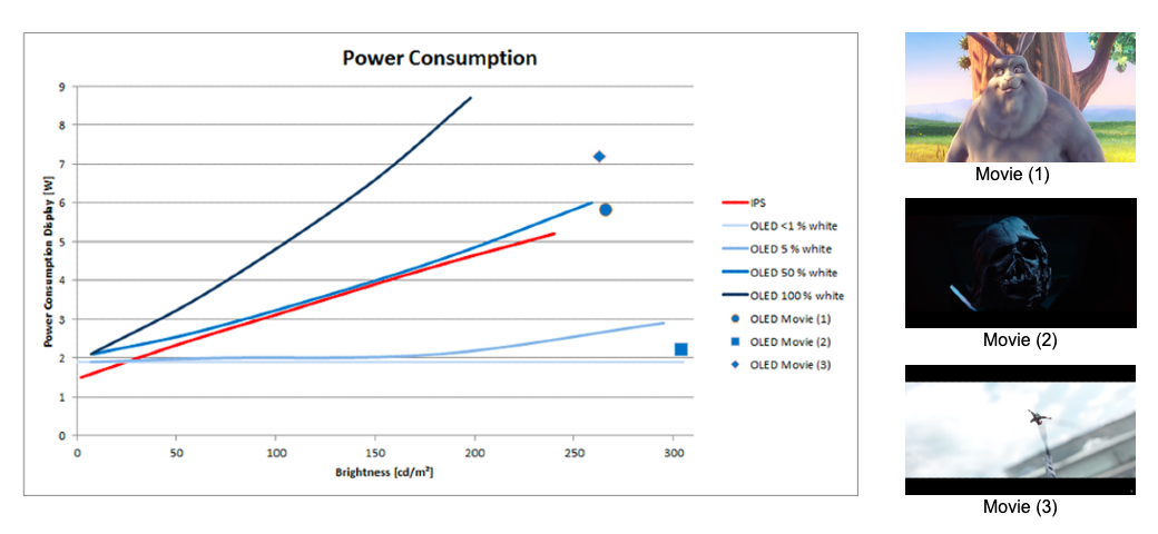
Figure 57: Graphic comparing the efficiency of OLED and IPS technologies when displaying different colors on screen (source)
As shown above in Figure 57, the OLED display has an efficiency advantage over LCD screens when displaying dark pixels. For this reason we selected black as the main color for this theme (Figure 58). The background is black, and no decorative images were added with the aim of enhancing efficiency and not providing distractions to the user. Images featured in the articles appear smaller and in grayscale, enclosed in a circle. The circle expands to show the whole image when the mouse hovers over them, which is displayed in color (Figure 58, bottom). The reduction in area of pixels, while minimal, goes to show the extent of minimisation of energy usage in the future.
The displaying of images in black and white by default is a note towards another extreme energy saving technology in displays that could potentially be extremely widespread in the future: e-ink. E-ink displays are extremely efficient on non-updating pixels, but are only capable of reproducing content in binarised form (each pixel is either on or off). The user with an e-ink display would need to waste computational power to convert a RGB image to a binarized one. A black and white image would need considerably less.
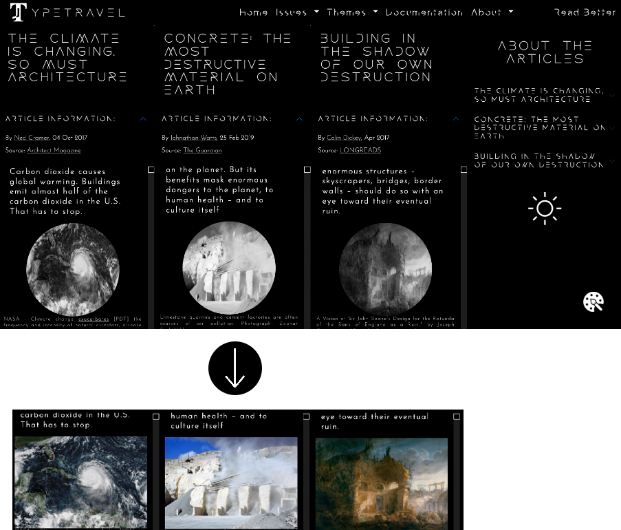
Figure 58: Screenshot of the article section with future theme (above), images on mouse hover (below)
Text appears white on the black background. Very thin fonts were selected for the Future theme. They are Rocket Wildness, Despairs and Josefin Sans, three minimalistic, geometric and futuristic fonts, features that we imagine will be at the core of design in the future decades (Figure 59).
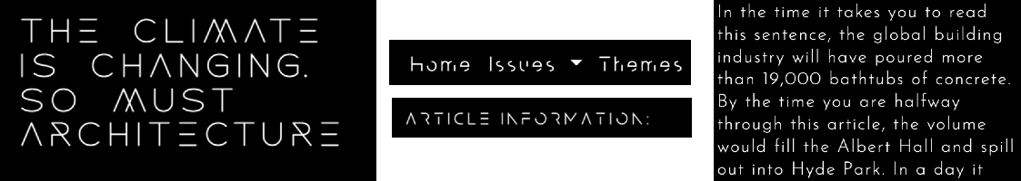
Figure 59: Screenshots from the articles section displaying the fonts Rocket Wildness, Despairs and Josefin Sans
Even if dark mode is strongly suggested by the webpage, users have the possibility to switch to light mode if necessary (Figure 60 - left) - for example, for reasons of visual fatigue. However, this is not encouraged, as shown in Figure 60 (right), which displays the button to switch from dark to light mode with a warning message (in fact, if you do not need it, switch to dark mode right now!). However, since the amount of consumed energy is considerably relevant, light mode is only available on pages featuring longer texts.
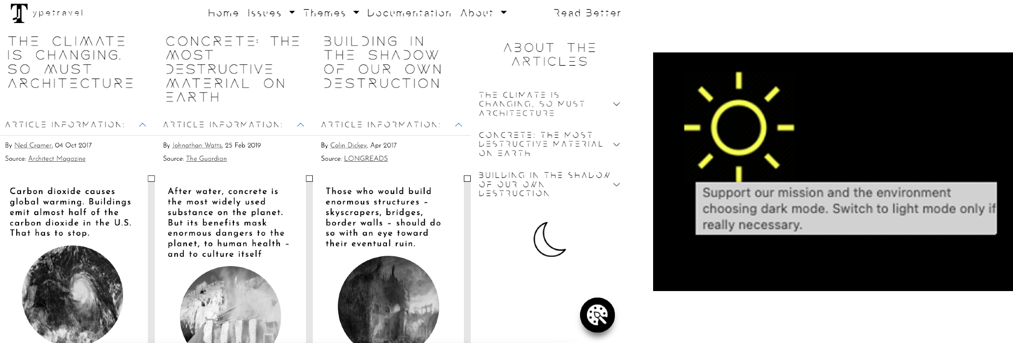
Figure 60: Screenshot from articles section, light mode (left), light mode button with alert message (right)
COLOR SCHEME
For the reasons mentioned above, the only colors of this theme are black and white; to provide users with quality content, images were however displayed in grayscale and in color on hover.
Color Black
Color White